The Following Guidelines Will Assist You In Preparing Your Art, Player Names, Logos & More For Your Silk-Screen Project
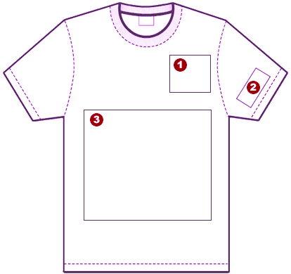
Front Guidelines:
1. Heart/Pocket Ideal measurements for Heart logo: 4-5 inches.
2. Sleeve Ideal measurements for Sleve logo: 3-4 inches.
3. Front shirt design Ideal measurements for front dersign: 11×15 inches.
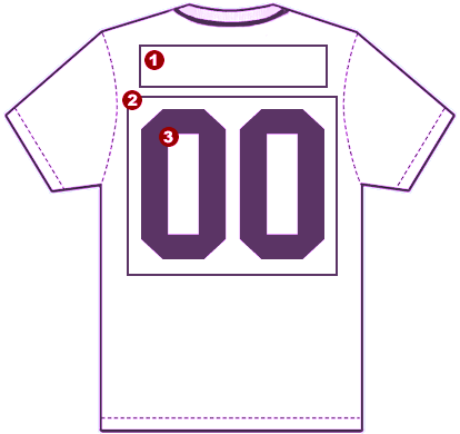
Back Guidelines:
1. Custom Lettering Each letter is 2″ – Maximum number of letters is 16.
2. Back Design Same as the front – 11×15″
3. Custom Numbering Youth: Each number measures 4 inches Adult: Each number measures 6 inches.
General Guidelines:
High Resolution Vs. Low Resolution
This sample is a high-resolution graphic, because it holds a quality of 300 dpi or higher. The lines are crisp, clear, and will reproduce cleanly. No clean up work is required.
This is a low resolution graphic that was taken from the web and enlarged. The edges are fuzzy and will require a lot of clean-up prior to printing.
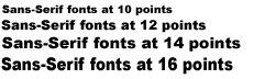
Best Fonts & Texts For Printing & Pressing
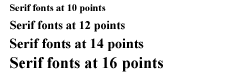
Because silk-screening is not print, small text may sometimes be difficult to print. For small text, we suggest using a san-serif font set at 10 points or higher. Above is an example of a comparison between a sans-serif font and a serif font.
The 10 point Sans-serif font will reproduce on a silkscreen design whereas the 10 point serif font will be difficult to reproduce on a t-shirt or other garments, due to the small size. Of course, you may use other fonts if you so desire.
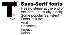
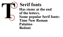
Sans-Serif Vs. Serif Fonts
Sans-serif fonts have no stems or any fancy embellishment at the ends of the font. They are usually blocky in appearance.
Some popular sans-serif fonts are: Arial, Helvetica, Impact, Kabel
Serif fonts usually are decorative or have curved stems. They typically appear more sleek, enticing and professional.
Some popular Serif fonts are: New Century Schoolbook, Typewriter, and Bodoni.